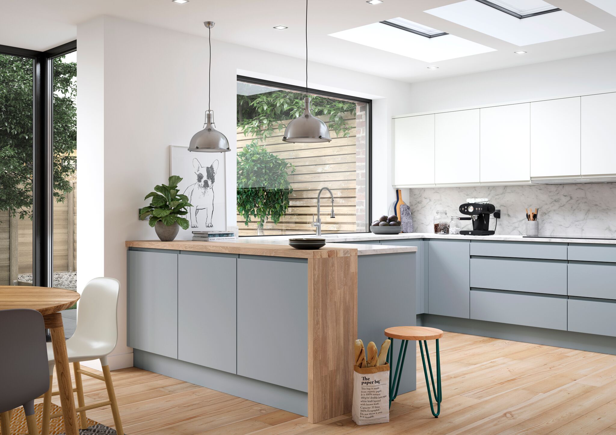
Our Kitchen Collection 2024
Why Deelux
FARROW & Ball 9 NEW COLOURS FOR 2016
29th March 2016Introducing the nine new colours for 2016, each colour works perfectly in harmony with all the existing colours in the palette.Soft neutrals and muted pastels,to strong brights and rich dark tones.The nine new colours are a natural addition to the palette.Beautiful colour schemes perfect for a traditional or modern home.
SHADOW WHITE NO.282

Shadow White is the lighter version of Shaded White so the two are linked and work perfectly together. Both names are taken from the soft tone created when whites are covered in a deep shade.
With none of the perceived yellow of Slipper Satin or the grey of Ammonite, Shadow White will work perfectly in any style of home. This versatile colour is perfect when paired with both Shaded White and Drop Cloth, and creates beautifully understated rooms when used on ceilings or woodwork.Use in south facing rooms to create the perfect soft ‘shaded’ feeling.
DROP CLOTH NO.282

Drop Cloth is a darker version of both Shaded White and Shadow White, acting as the strongest hue in the group to complete this trio of colours that work in any style of home to give a classic look. It reads neither too yellow nor too grey making it the perfect colour for those who are wary of the fashion for grey and avoid tones that are too cream.
For east facing rooms the colour will appear stronger in the morning, becoming a more muted tone as the day goes on.
WORSTED NO.284

Worsted works very well as the stronger tone when paired with Wevet, Strong White or Cornforth White. A little darker than Purbeck Stone but not as strong as Mole’s Breath this hue works fabulously as a wall colour in its own right, or as the perfect background to be punctuated with clean accents.
In north facing rooms this hue will appear as a stronger and grittier grey.
CROMARTY NO.285

Cromarty, the lightest colour in the Mizzle, Blue Gray and Pigeon family is pretty and its ease of use means that it can create the softest of rooms which are neither too blue nor too grey. It is the perfect tone for those who like to keep things soft and muted.
In west facing rooms the colour can change dramatically from neutral through to a fresher, warmer blue.
PEIGNOR NO.286

Peignoir will create the most humble, blushing interior as it is the softest of pinks containing a great big dose of grey. Its romantic feel makes it an obvious bedroom choice for a traditional home but it will add a certain charm to any modern living area. It works perfectly in combination with any of the Contemporary Neutrals as well as with the stronger Brassica and Brinjal.
Feels contemporary and crisp when combined with All White in south facing rooms.
YEABRIDGE GREEN NO.287

Yeabridge Green is the cleanest, freshest and most uncomplicated of our greens creating uplifting interiors especially when used in combination with Stiffkey Blue. With less yellow than Churlish Green, but more than Breakfast Room Green, Yeabridge Green is a true avocado green.
If you’re decorating in a room with northern lighting this tone will give an earthier feeling green.
VARDO NO.288

Vardo is an incredibly vibrant yet versatile colour that works so well with whites. It looks fantastically elegant when combined with the lighter Pavilion Gray and especially atmospheric with the darker Down Pipe.
Use in west facing rooms where the colour builds up throughout the day for a perfect glow in the evening.
INCHYRA NO.289

Inchyra Blue, like many of our colours, is difficult to put in a box. To some it reads grey and to others green, but what is for certain is that it is the perfect alternative to charcoal for use on walls in contemporary homes. However, it is just at home on the exterior of traditional properties. Its uncertain colour creates an unmatched moodiness especially when combined with Black Blue or Vardo. For the less adventurous it also works perfectly with all the Architectural Neutrals.
In west facing rooms Inchyra Blue will look stronger and less coloured in the morning but become more blue as the day progresses.
SALON DRAB NO.290

A classic 19th century warm drab, this colour has been much requested and works perfectly with both the Yellow and Red Based Neutrals as well as with Skimming Stone. It is stronger and cleaner than Mouse’s Back and far less red than Mahogany. Its richness is extremely appealing and will create rooms that have mid-19th century authenticity despite being perceived as the perfect ‘chocolate’ for the modern home.
Perfect for darker north facing rooms to make them feel cocooning and cozy.
Wide Range of Styles
Get the style that is right for you
Whether you are looking for a modern look or something more traditional, at Deelux we tailor the kitchen to suit your needs and can find the style that's right for you. Check out some of the styles on our website and if you have any queries or want to talk to someone about your designs please get in touch.